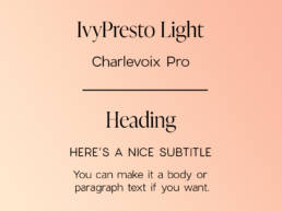
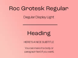
Font pairings are critical when building a brand. They can tie a a brand image all together and create a visual hierarchy.

Font pairing highlights the most important things to look for and focuses the reader’s attention on what matters the most. Using different fonts can improve the overall look of the design and prevent fonts from overshadowing one another. All fonts in this article can be found online for free.
IvyPresto Light can be found at: https://fonts.adobe.com/fonts/ivypresto-display
Charlevoix Pro can be found at: https://www.dafontfree.io/download/charlevoix-pro/

Roc Grotesk Regular can be found at: https://fonts.adobe.com/fonts/roc-grotesk
Degular Display Light can be found at: https://fonts.adobe.com/fonts/degular

P22 Mackinac Pro Book: https://fonts.adobe.com/fonts/p22-mackinac
Hero New Light: https://fonts.adobe.com/fonts/new-hero
Original ideas taken from @atnndesign on TikTok. Link to original TikTok: https://www.tiktok.com/@atnndesign/video/6930789127310904581?

